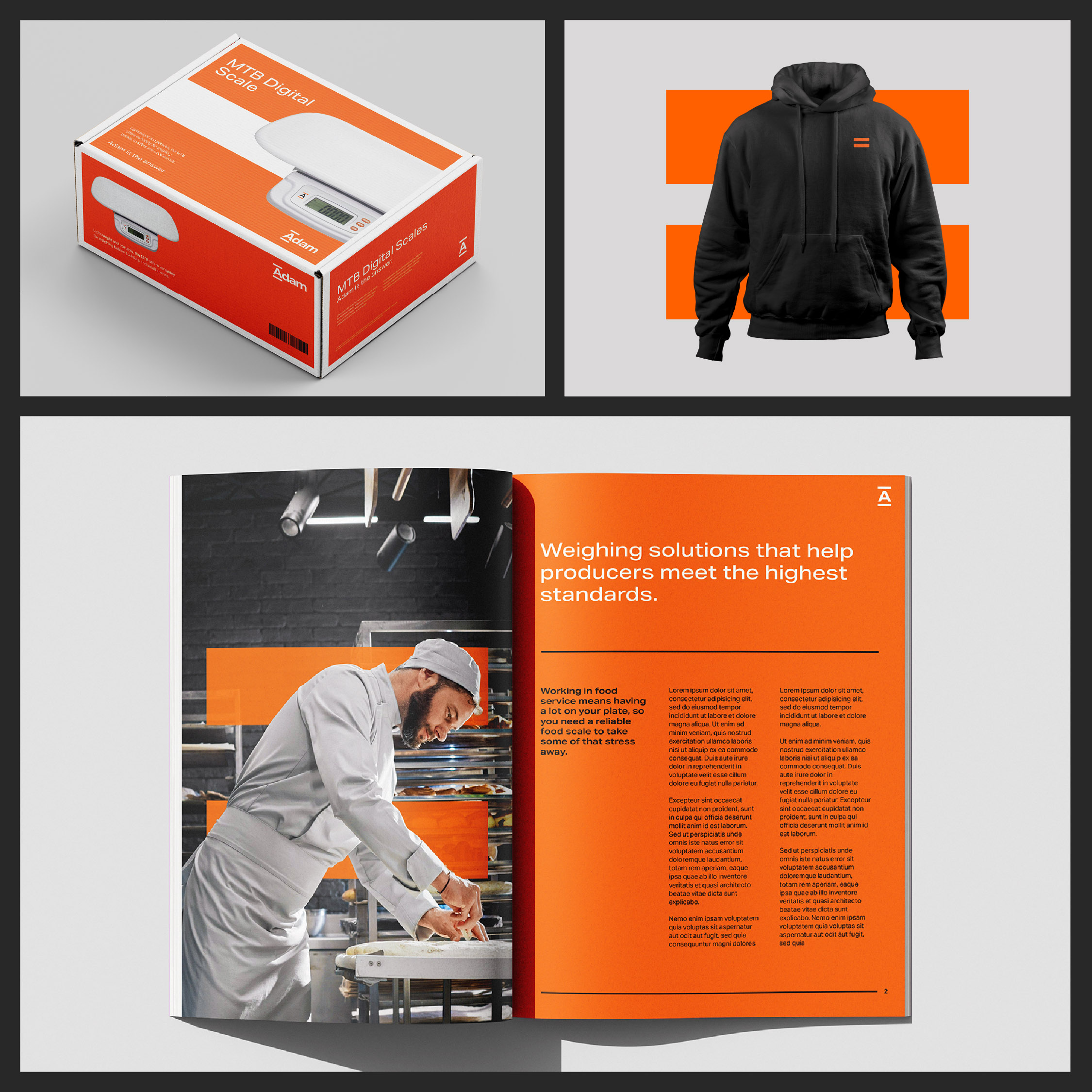
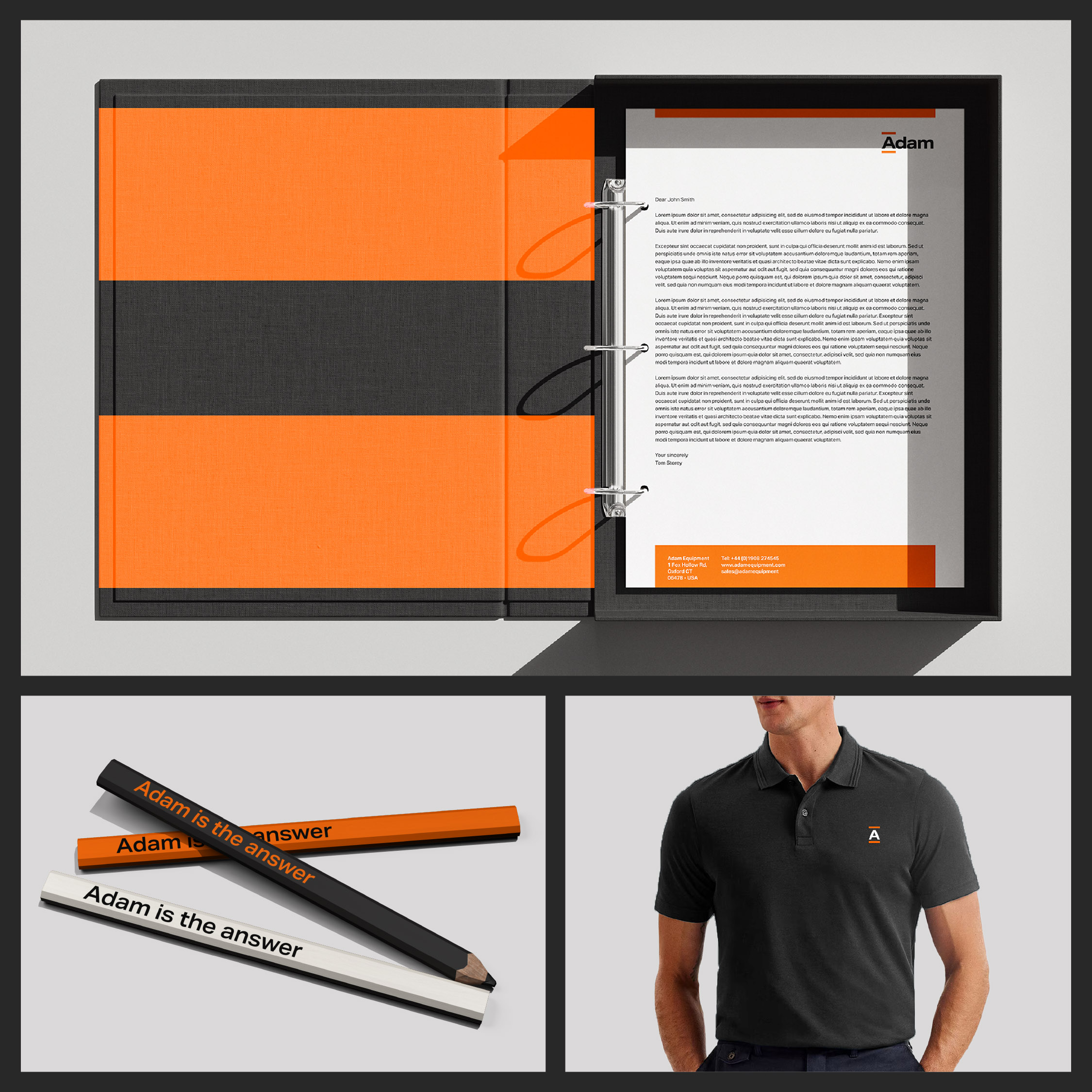
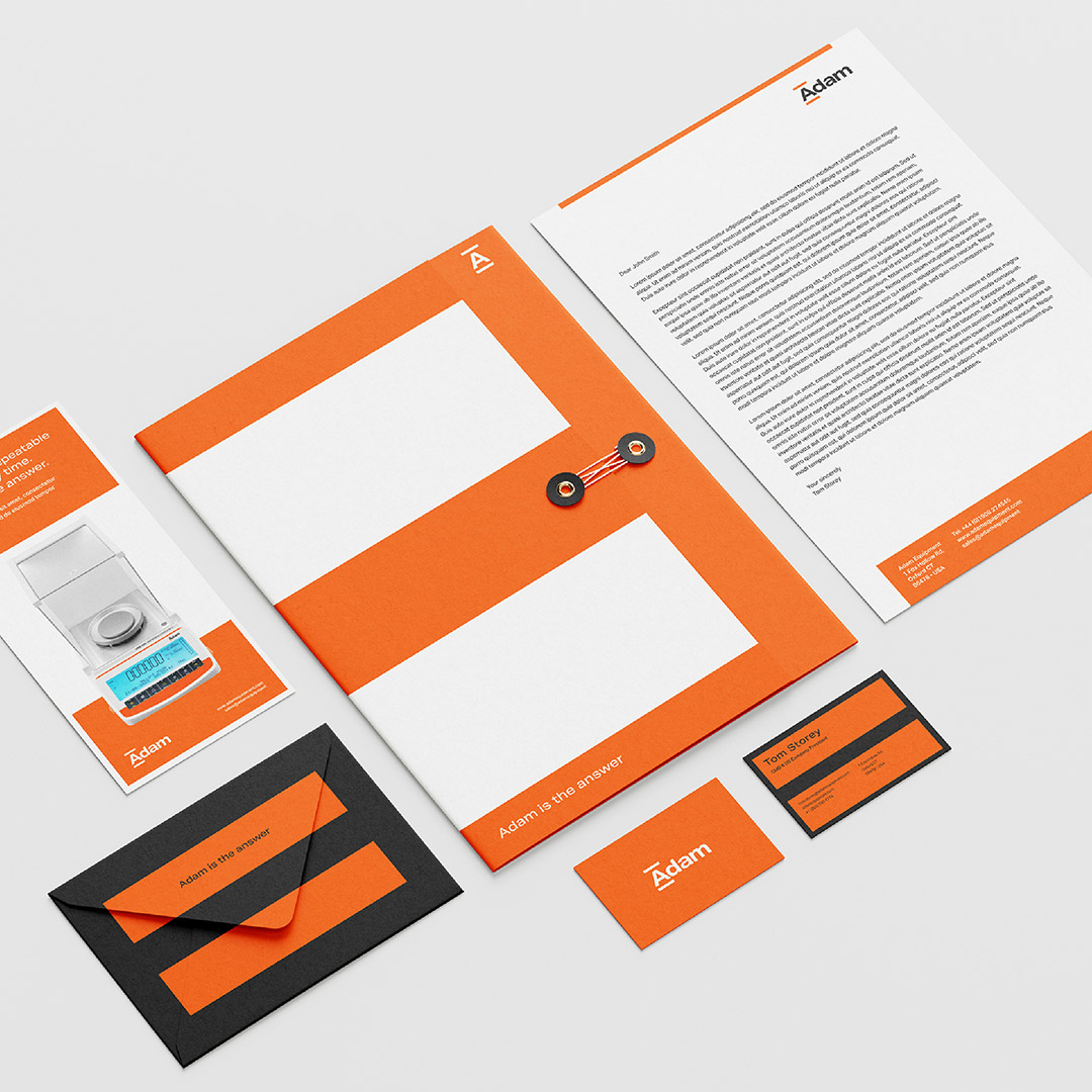
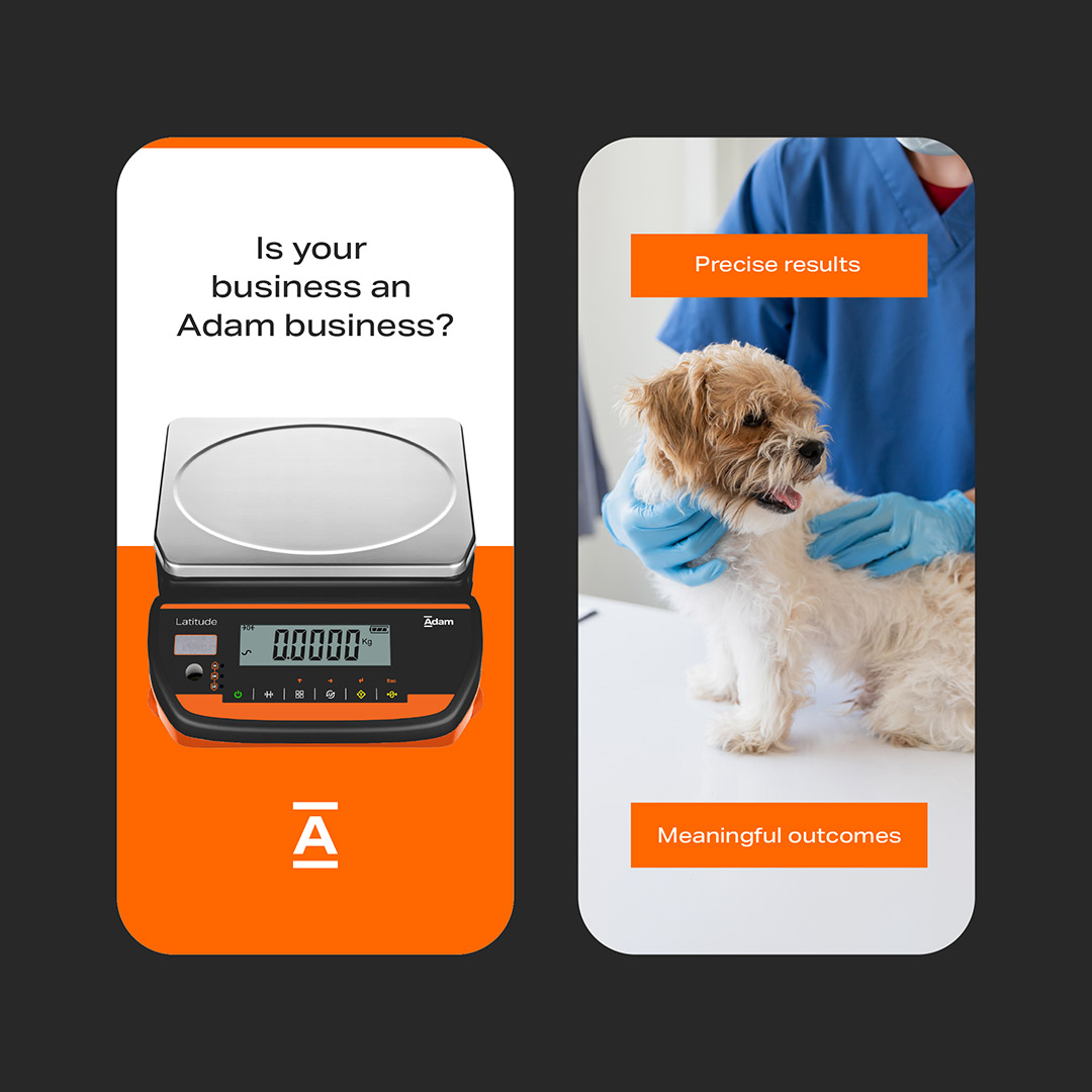
Now part of the Indutrade Group and with ambitions to grow, our task was to help Adam stand out from the competition and become the clear partner of choice for dealers and distributors of weighing equipment.
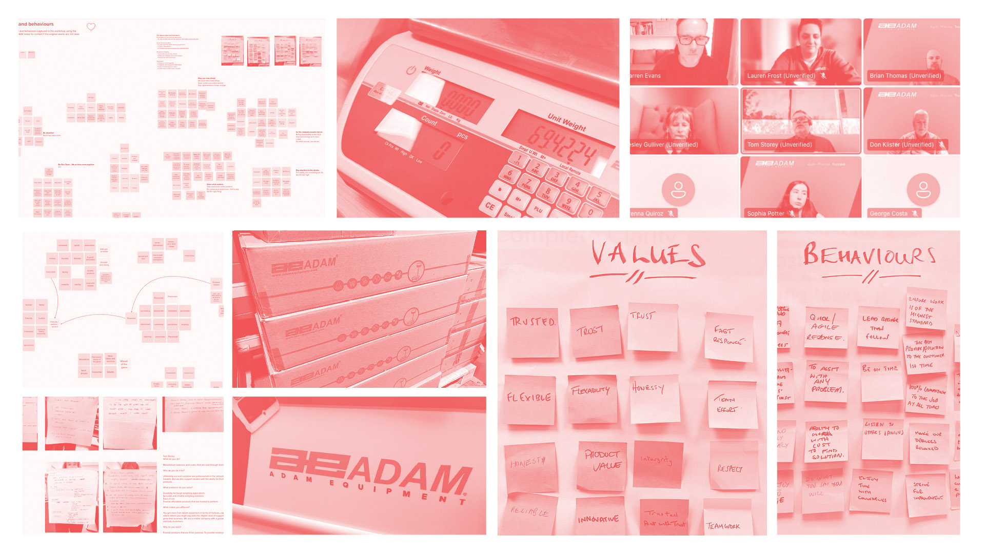
Working closely with the team at Adam, we uncovered a truth that had never been fully recognised. While competitors could all claim accuracy and reliability of product, customer feedback consistently highlighted something different - the people behind the business. That insight became the foundation of the brand’s personality - the measured problem solver.
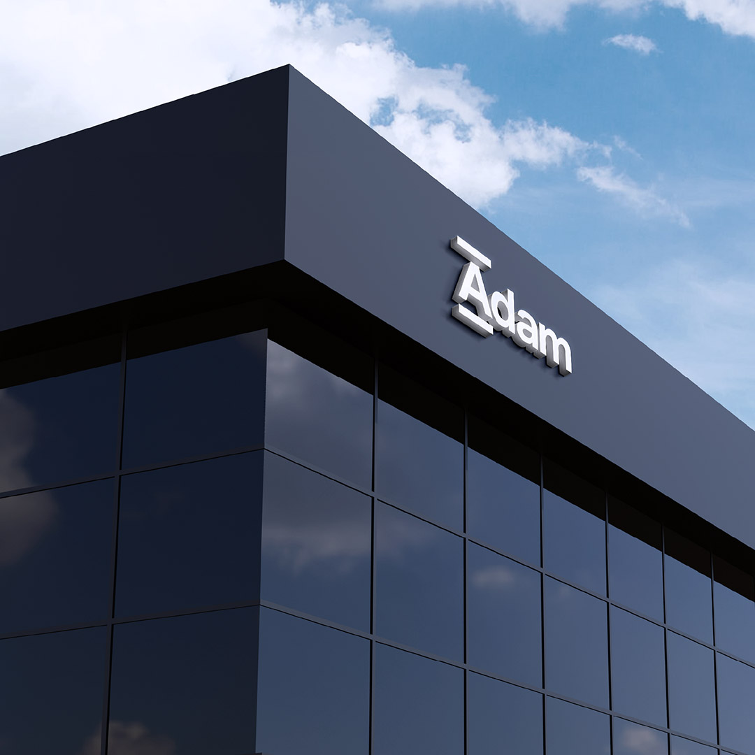
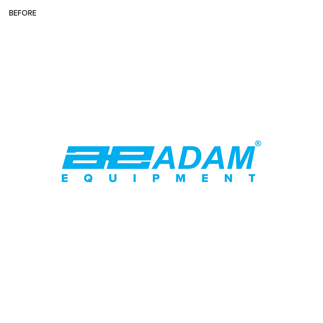
Dropping “Equipment” from the name felt like a natural evolution, with Adam presenting a more human and personal identity.
A clear new proposition was developed around three core pillars of the business: people, performance and price.
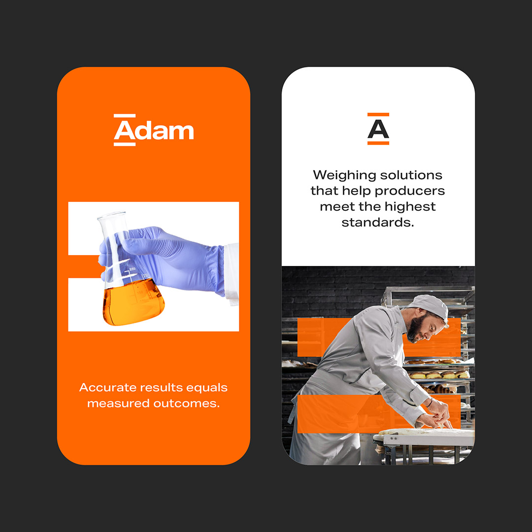
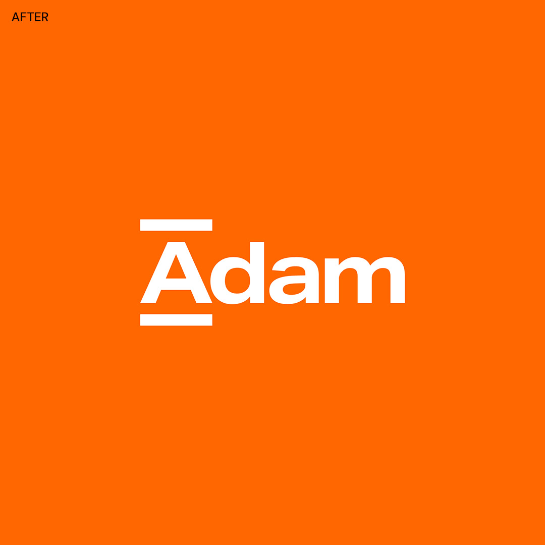
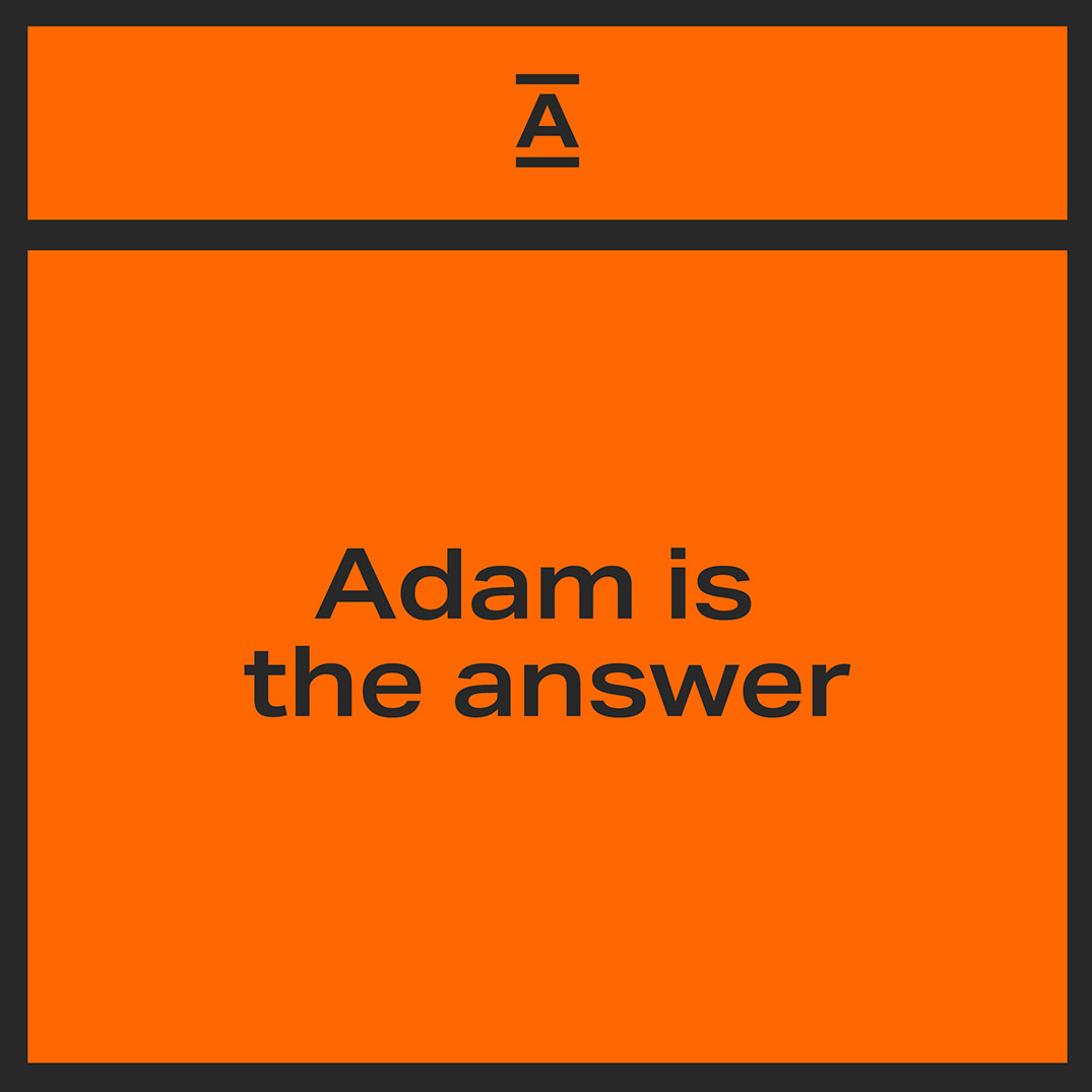
Led by the 'problem solver' personality, the concept Adam is the answer gave the identity its foundation. The equals symbol became the core graphical device - functional, flexible, and a reinforcement of accuracy and confidence. Placing Adam at the centre of the symbol in the logo locks the concept in place visually. Bold typography and a strong, bright orange complete the identity, setting Adam apart from its competitors, adding warmth and energy.


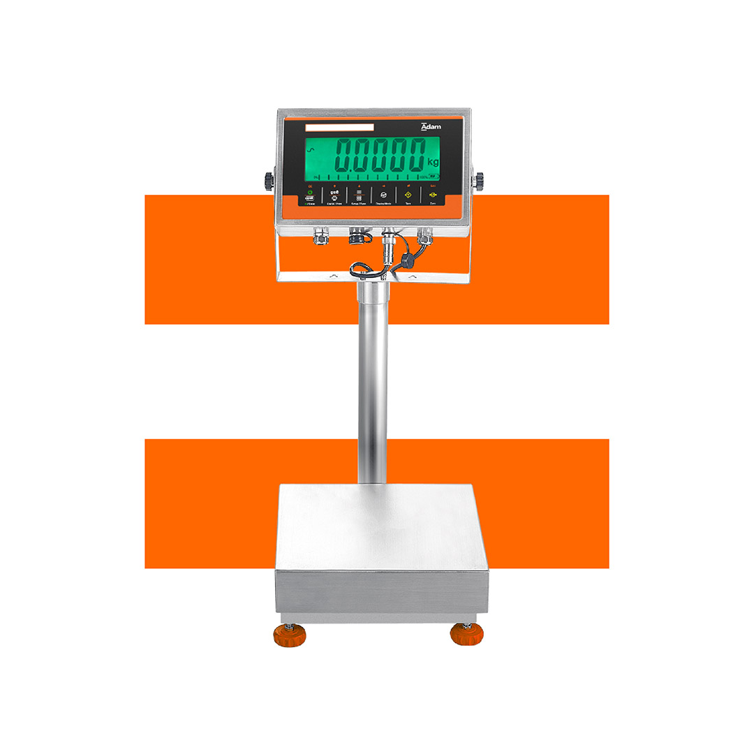
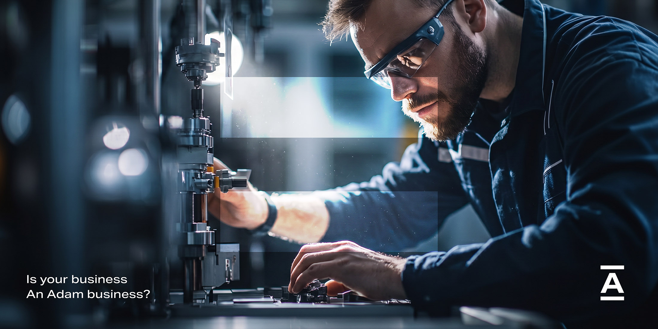


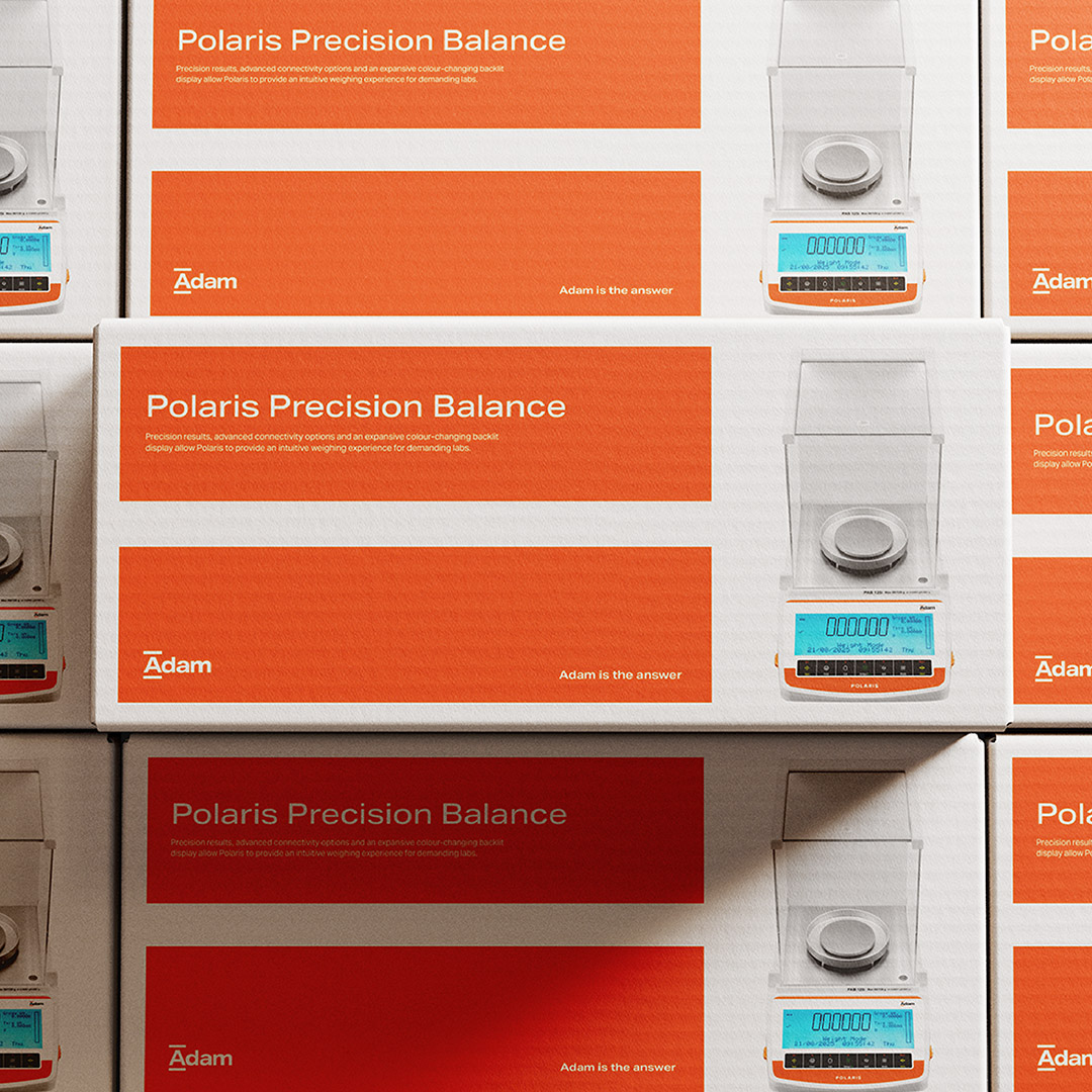
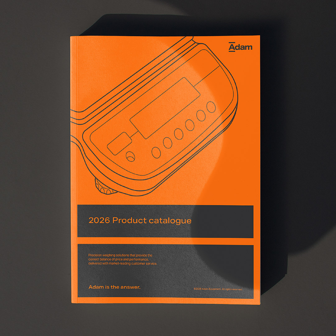
The refreshed identity is designed to be flexible across Adam's full range of touchpoints - from product catalogues and literature to product overlays and brand videos.