Strategic rebrand for an interiors business

Redefining the identity for a European disruptor.
Back button
Watch the 1 minute round-up >
Brand Project Overview
The international commercial interiors specialist with the proactive mindset.

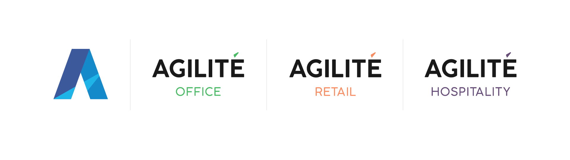
For a business that was only four years old, disruptive commercial interiors specialist Agilité had rapidly earned a reputation for excellence and experienced exponential growth.

With a to have a seamless pan-European business that can be operational in multiple locations for multiple customers; The Engine Room helped to bring their brand up to speed positioning Agilité as the flexible operator in an often inflexible industry.

Key Business Challenges

A rapidly growing business with employees spread across Europe.

How might they galvanise the team?

Operating differently, but not communicating this difference.

How might they tell this story?

Competing against much bigger competition.

How might they stand out?

Brand process
Insight workshops to understand the business and its values.
  • In-person workshops with the leadership team in Paris.
  • Remote workshops across Europe with the wider team.
  • 30 team members engaged.
  • 10 customers interviewed.
  • Mapping the service process and customer journey.
  • Partner interviews.
  • Competitor review.
  • Uncovering key business challenges.
  • Defining purpose, principles and personality.
  • Reframing the proposition.
Agilite logo and words on a billboard
Brand Strategy - The Headlines

Brand purpose.
We exist to optimise our customer experience and minimise our environmental impact.

Brand positioning.
Redefining spaces.

Brand personality.
The resourceful problem solver.
Problem solvers. Purposeful. Genuine.

Brand proposition.
Agilité Solutions is the international commercial interiors specialist with the proactive mindset. We breathe new life into spaces for world-leading brands.


Reframing, naming and visualising 
an often ‘invisible’ process – PACE.
The process that makes Agilité different.
Brand Identity
  • A solutions-focused proposition
  • A revised and simplified sector-focused service architecture
  • Evolving the logo and visual identity to include context and
    meaning - redefining spaces
  • A new website built in four languages 
  • Detailed brand guidelines and document templates for their internal team to control brand application
Strategic rebrand for an interiors business

Changing the face of cancer

View project

It's a SILVER!

View article
White arrow on a orange circle
linkedin facebook pinterest youtube rss twitter instagram facebook-blank rss-blank linkedin-blank pinterest youtube twitter instagram