Brand design for PR agency

Uncovering the spark that makes a difference.

Brand Project Overview

Scriba PR is a strategic, B2B communications agency – renowned for its technical expertise in sectors ranging from waste and recycling to technology and telecoms.

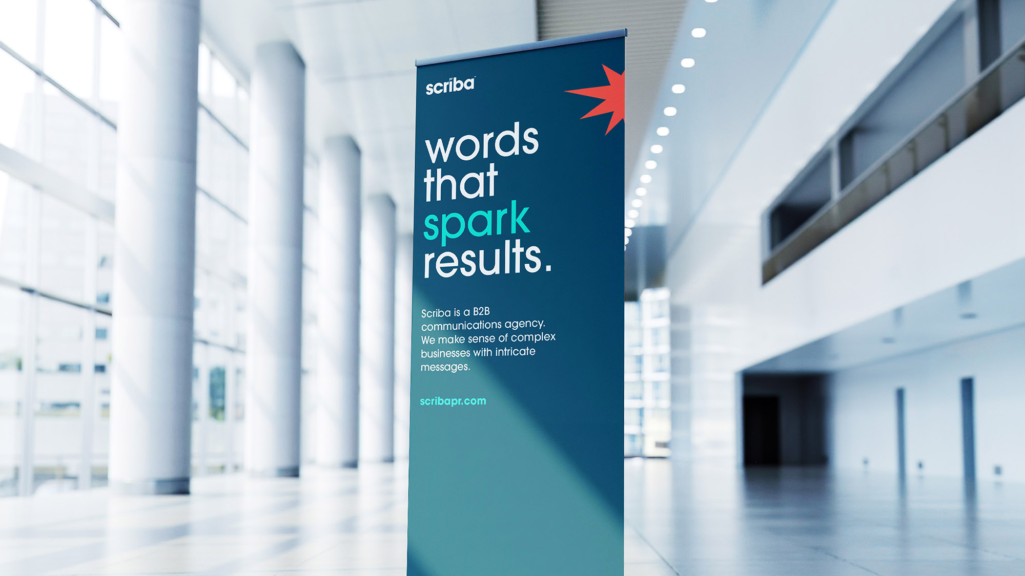
However, when the company’s growth trajectory continued to advance at pace as it headed into its eighth year of operations, a lack of space and time to perfect its own identity, became apparent. Our Strategic rebrand for this PR agency sparked a change...

Key Business Challenges
A successful business whose brand had not kept pace with its rapid growth.

How might we articulate what makes them different?

A proposition that did not reflect the breadth of the company’s offer.

How might they tell this story?

Struggling to articulate what made them different.

How might we help define their values?

A ‘tired’ website that was not reflecting the vibrant and passionate personality of the business.

How might their personality be represented?

Brand Process
Discovery workshops to understand the business and its values.
  • In-person workshops with the entire team.
  • 11 customers interviewed.
  • Review of internal values and behaviours.
  • Mapping the service process and customer journey.
  • Competitor review.
  • Audit of current identity.
  • Uncovering key business challenges.
  • Visioning the future.
  • Defining purpose, principles and personality.
  • Reframing the proposition.
Scriba brand development insight workings

Brand Strategy

Our words mean business.

Brand purpose:

We exist to make a positive impact.

Brand positioning:

Our words mean business.

Brand personality:

Determined. Smart. Trusted. Playful. 

Brand proposition:

Scriba is a B2B communications agency. We make sense of complex businesses with intricate messages.
Strategic rebrand for PR agency Scriba.
Strategic rebrand for PR agency
Brand Identity
Word driven identity evolution.
  • Defined and named their process SENSE - Making sense of the complex.
  • Bringing life to Scriba SOUL through reframed brand principles - visualised in the Scriba book of SOUL.
  • Defined what makes Scriba different - the Scriba Spark.
  • An evolution of the previous identity introducing a word-driven toolkit.
  • Detailed visual guidelines.
  • Designed brand touchpoints including the website and templated assets.
  • Internal launch.

More stories:

Central Networks brand image

Putting IT at the heart of your business.

Cheshire council Workshop

Making Cheshire West and Cheshire an age-friendly borough.

High Street Task Force Sign

Redefining the high street.

Vapour Rebrand Image

The hidden technology behind powerful business.

Sign up to
Unpacked.
A deep dive into the world of design and brand.
Subscribe here >
linkedin facebook pinterest youtube rss twitter instagram facebook-blank rss-blank linkedin-blank pinterest youtube twitter instagram